Produced piece · Limited edition
TAG HEUERMONACO
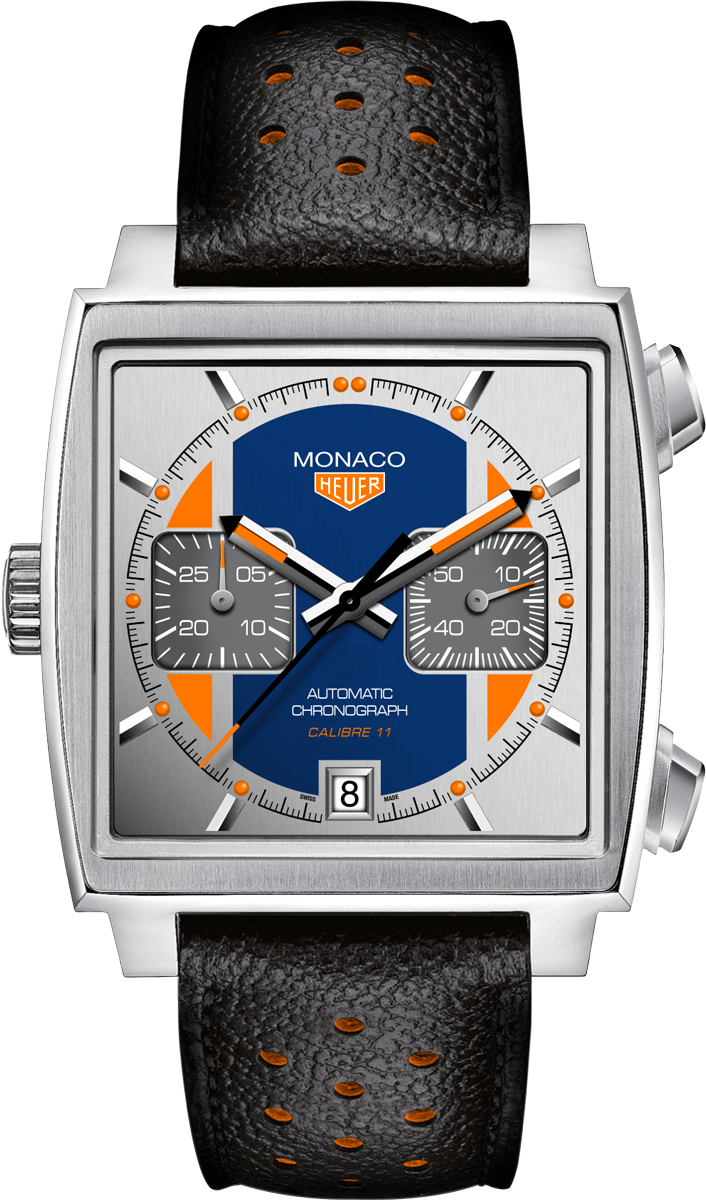
A graphic reinterpretation
of an icon.
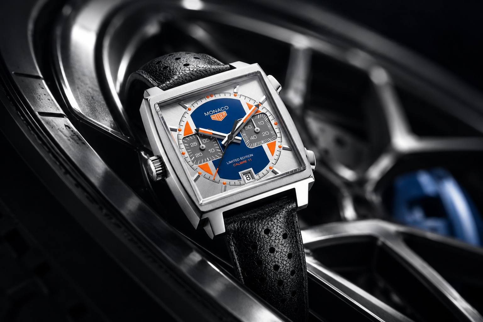
The project
An icon does not need to be reinvented. It needs a new reason to be looked at.
The Monaco is defined by a silhouette that is impossible to mistake. This project works within that identity, using colour, contrast and dial architecture to introduce a sharper contemporary character without erasing what made the watch recognisable.
Working with recognition
The starting point was not the square case alone, but the visual tension that has always made the Monaco distinctive: technical and expressive, precise and unconventional.
The design preserves this tension while reorganising the dial into a clearer graphic system. Every intervention is calibrated to feel new at first glance and coherent on closer inspection.
Familiar in silhouette.
Unexpected in detail.
Colour as structure
Rather than treating colour as decoration, the composition uses it to establish hierarchy. The dial, counters, hands and markers are read as one controlled system, giving the watch energy without sacrificing legibility.
The result is a limited-edition identity that belongs to the Monaco family while retaining a voice of its own.